Presidential ears
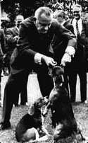
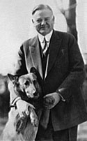
Some presidents’ relationships with their dogs have been the focus of historical commentary–most notoriously Lyndon Johnson’s penchant for picking up his two beagles, “Him” and “Her,” by their floppy appendages (more benignly, Herbert Hoover’s love for his pack of pets, especially his German Shepherd King Tut, helped construct a more compassionate image for the more convincingly impersonal chief executive). But it was Johnson, whose own ears were a fairly prominent aspect of his appearance, who came to mind last weekend at a symposium on Picturing Politics sponsored by the Illustration Program of the Parsons New School of Design and the Politics Department of the New School for Social Research—as did those of our 43rd president—because the cartoonists and graphic artists gathered to talk about various approaches to visual commentary inevitably turned to the subject of our president-elect and how they might contend with the always knotty subject of the representation of race. That discussion was curtailed due to a very full program schedule, but one participant observed in a later conversation that, indeed, it was Obama’s ears that might become—have already become—the safest feature for caricaturists, wary of the hazards of racial physiognomy, to emphasize. Obama’s lankiness is another uncontroversial aspect that artists have already relied on; indeed, the surly conservative cartoonist Glenn McCoy has taken to drawing Obama with a pear-shaped figure in an effort, bereft of any actual inspirational feature, to manufacture a “negative” somatic sign for the future president.
How President Obama has been and will be drawn strikes me as a golden opportunity for history teaching because it so starkly links the present to the past, and especially how Americans have conceived of and seen race throughout our history. Visual racial stereotyping too often is avoided as a topic for classroom discussion because it is, without question, painful to its victims; but avoiding the subject leaves students locked in a simplified understanding of how such signs worked and how some somatic signs may have conveyed to viewers in the past specific class positions within broader racial and ethnic categories (an aspect also true for some nineteenth-century images of Irish immigrants, where the poorest, least Anglicized newcomers—the so-called “shanty Irish”—bore simian features while middle-class Irish lacked such invidious signs). Moreover, how racism could be conveyed without resort to such pictorial devices is equally important to get across: Barry Blitt’s controversial July 21, 2008 New Yorker cover was meant to be a satirical dig at the hysterical and vicious fictions about Obama promoted by the Right during the presidential campaign; although Blitt did not exaggerate any physical features, some people mistook the illustration as a racially-tinged attack because of the “terrorist” costumes, defiled Oval Office decor, and other items that composed the surrounding pictorial narrative (exacerbated, perhaps, by the lack of a contextualizing title or text). This particular confusion notwithstanding, Blitt’s actually sympathetic commentary as well as truly malevolent illustrations (such as this November 26, 1898 Collier’s Magazine cover, which propagated the lie that the Wilmington, North Carolina, race riots of that year were provoked by “gun-toting” African-American residents) demonstrate that “realism” is not the simple remedy for stereotyping and that, to truly evaluate the visual historical record, students need to do more than rely on first impressions and should imagine the ways people saw in the past.
Last 5 posts by Josh Brown
- The Civil War Draft Riots at 150 – A Public Event - June 17th, 2013
- Alfred F. Young - November 7th, 2012


